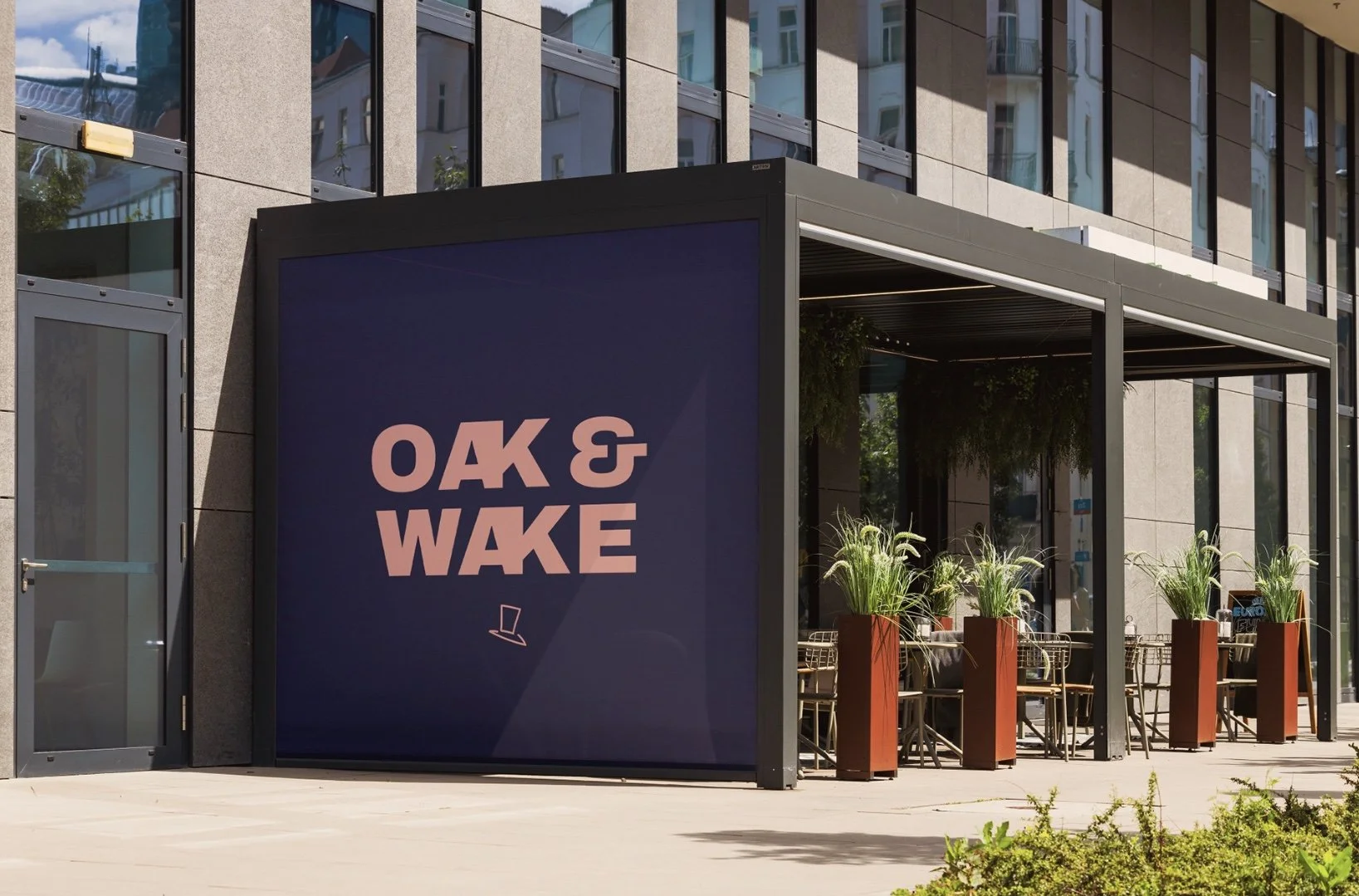
Oak & Wake
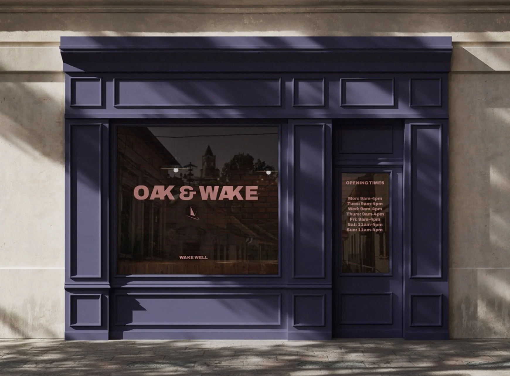
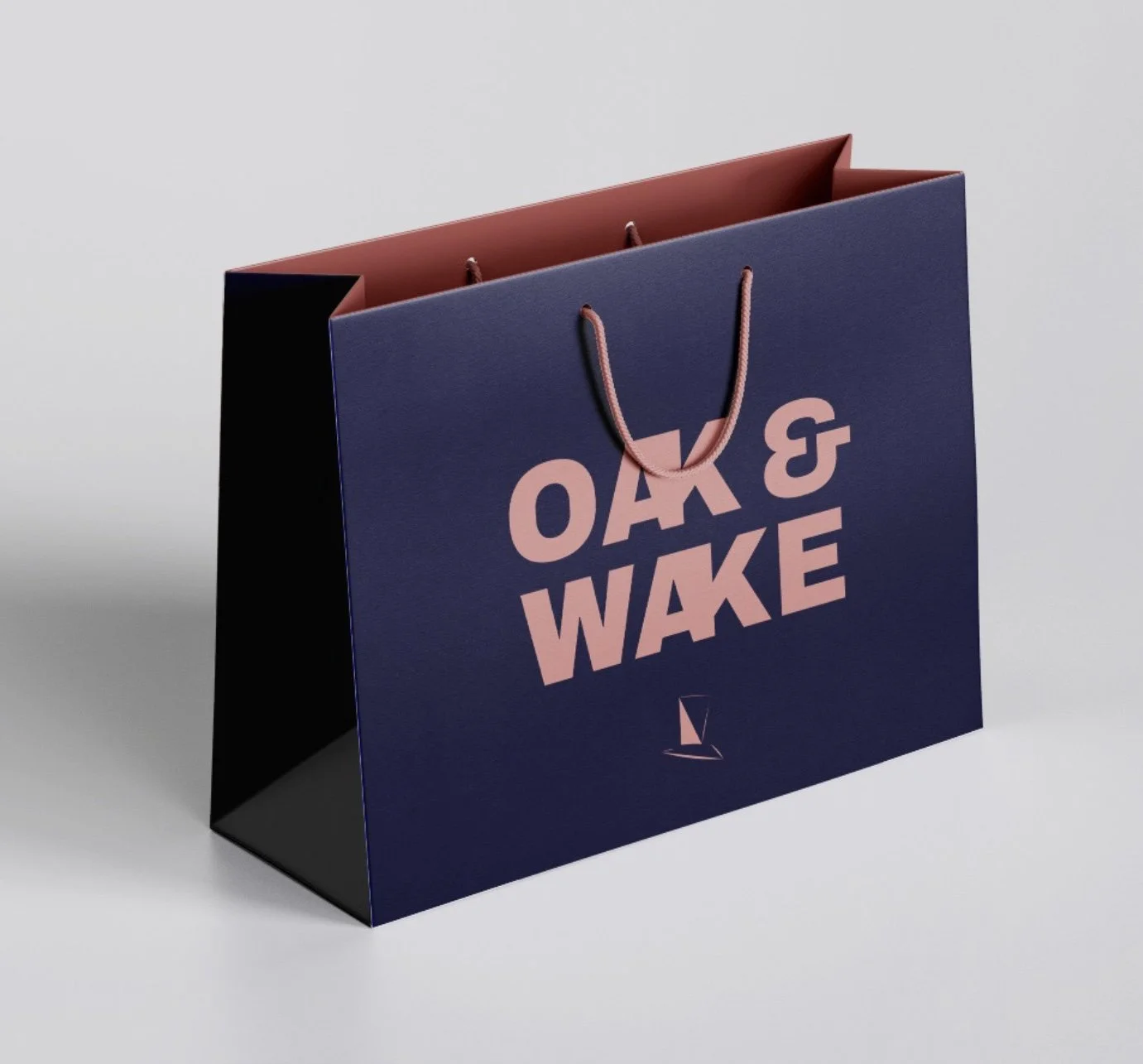
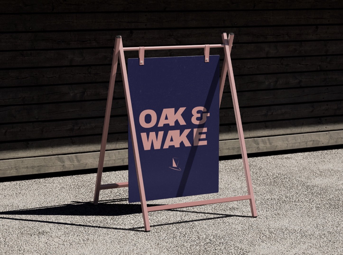
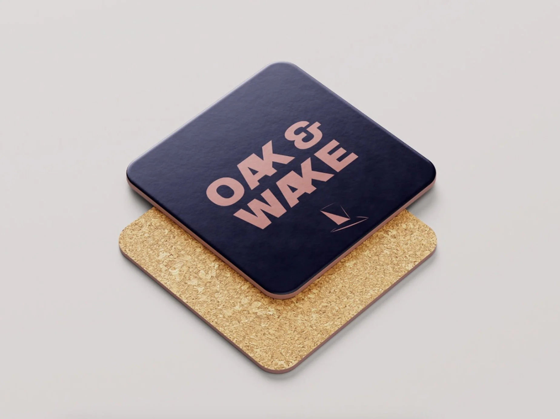
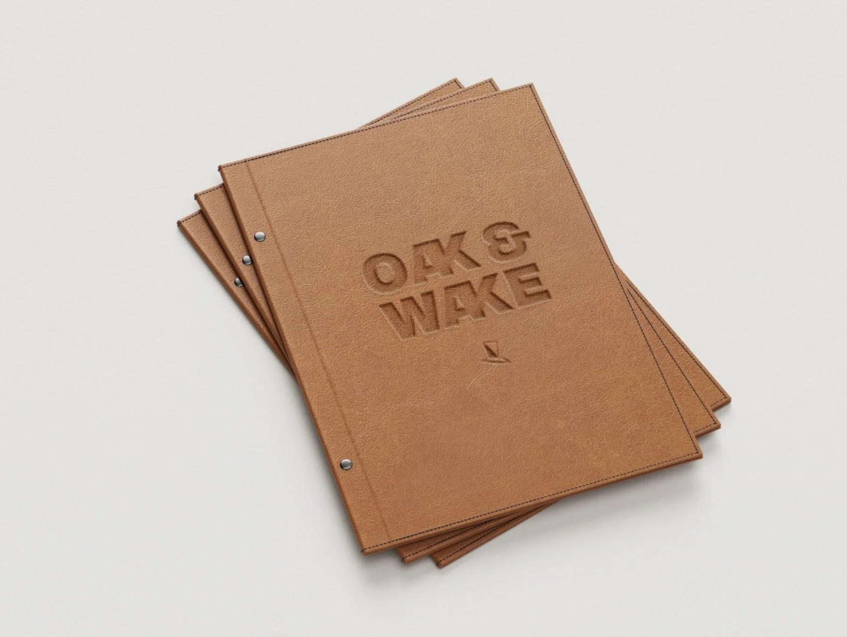
A passion project that I experimented with branding and colours. Oak & Wake, a coffee shop on the high street of Notting Hill.
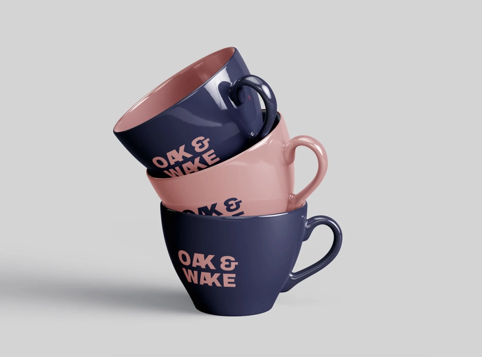
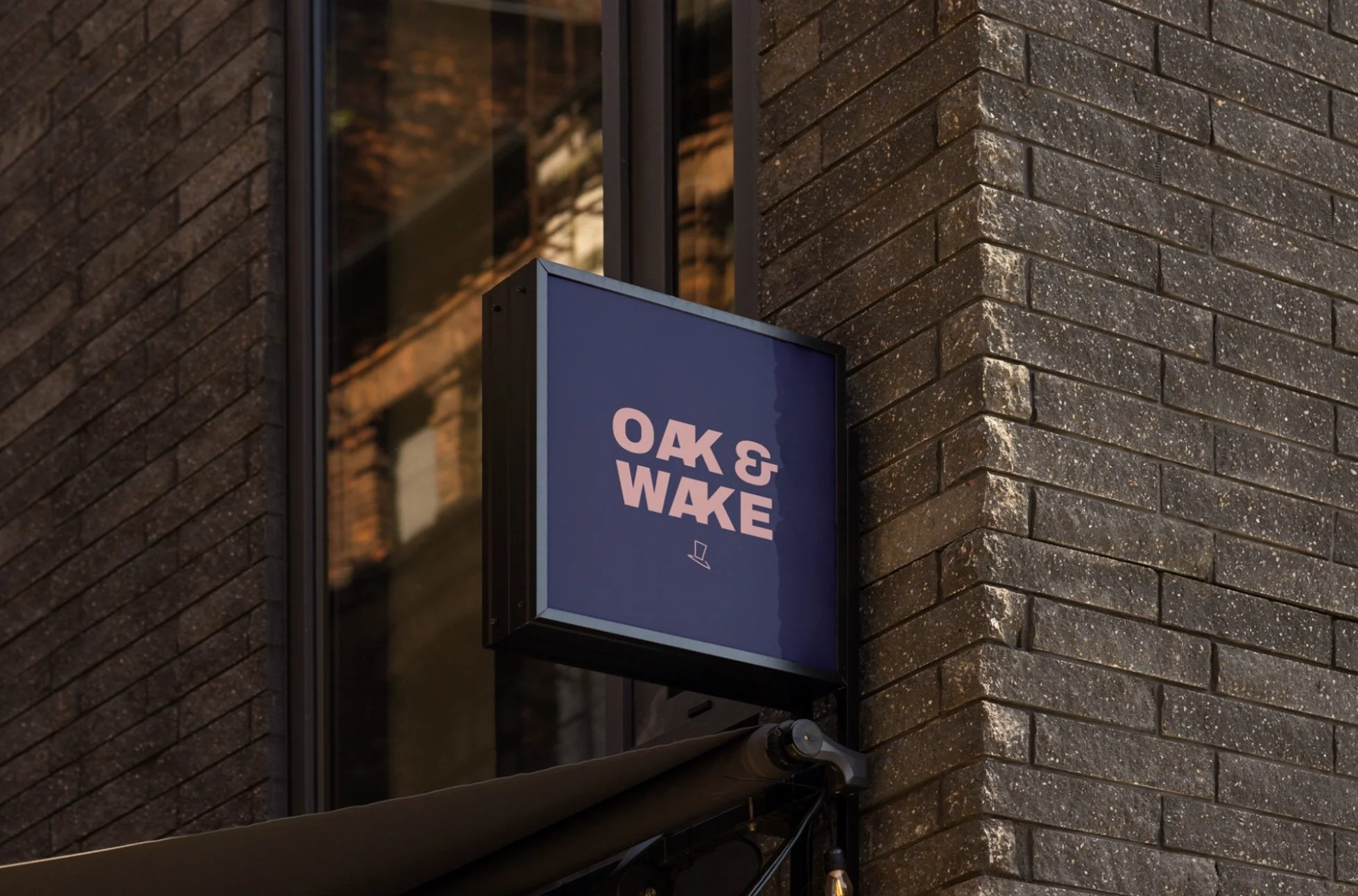
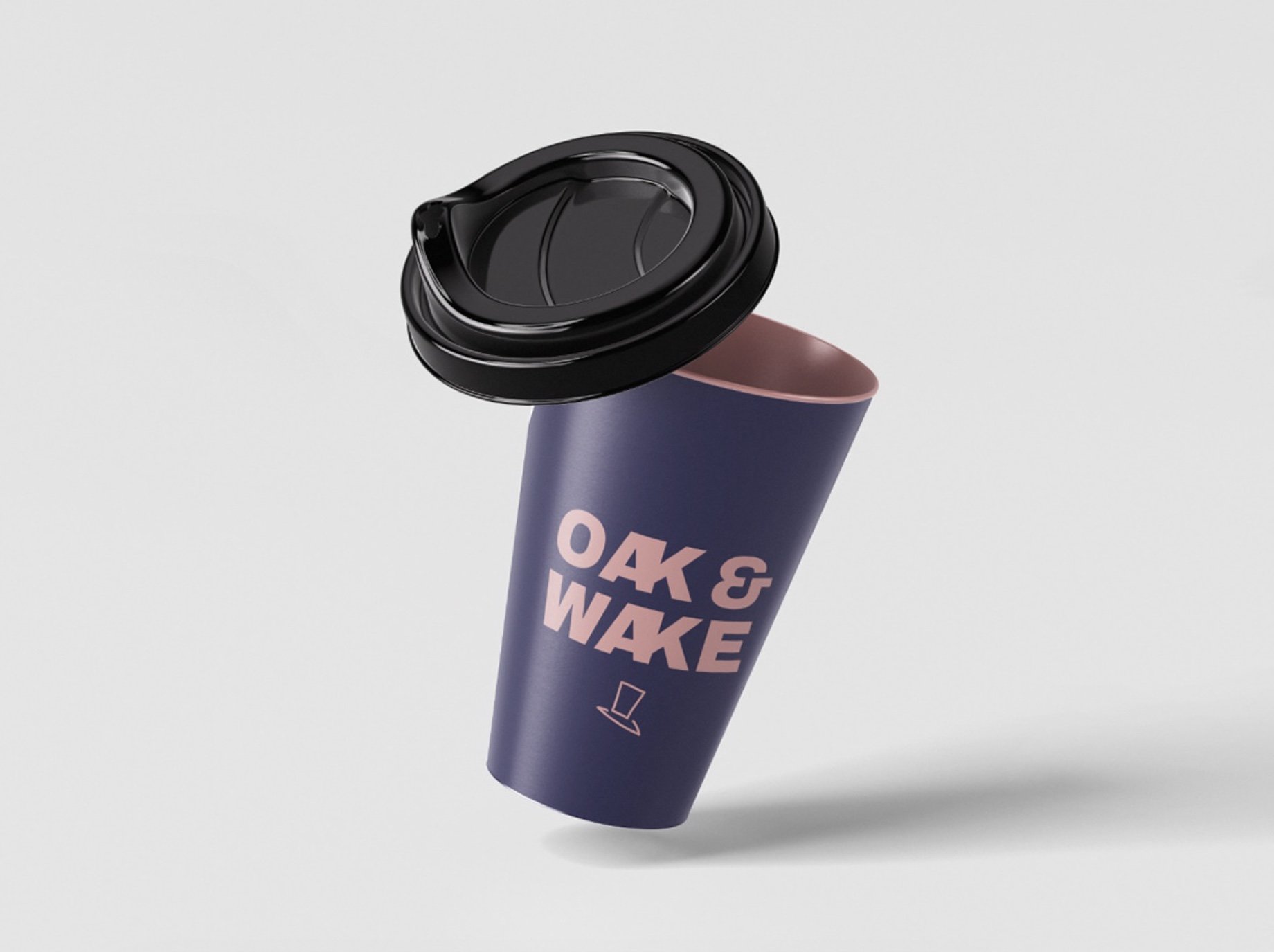
The brand is based upon comfort, craft, and connection. I came up with the name, Oak & Wake, because of the connotations of both individual words in the brand's name. 'Oak' signifies strength and natural blends, and 'Wake' relates to the calming rituals of waking up, getting ready for the day. It is a modern brand, that has a strong visual structure, clean, bold typography and a timeless colour palette that stands out.